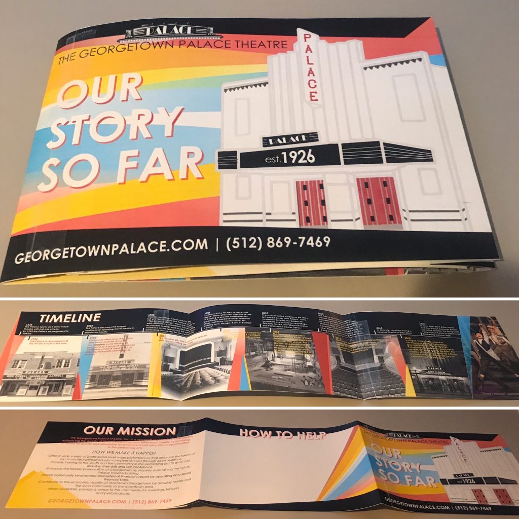
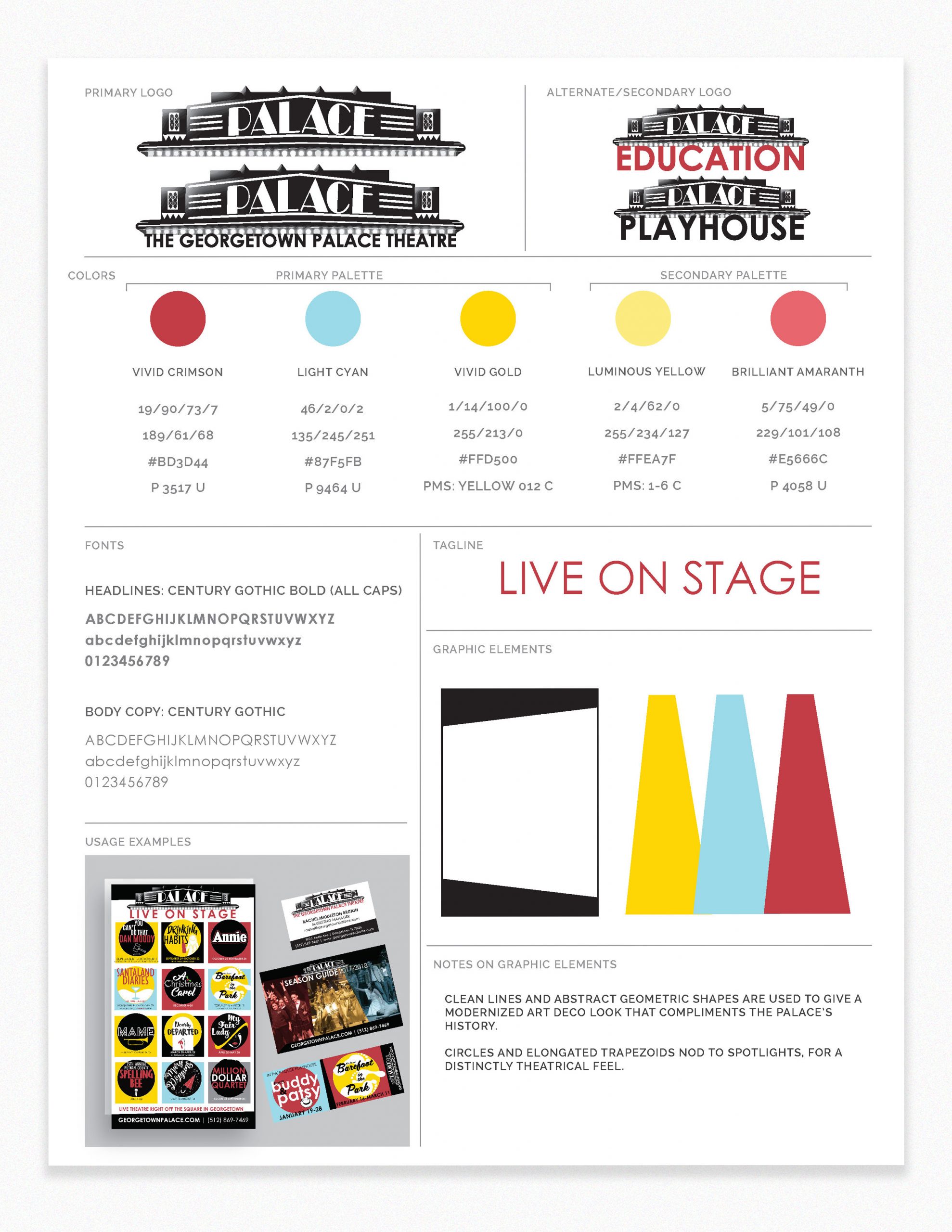
When I started started at the Palace, all they really had was a 1000×100 pixel jpeg of the original logo inspired by the marquee, and multiple different shades of a “theatre curtain burgundy.” The first thing I did after vectorizing the logo was to establish the red, and their brand story fell into place for me from there.
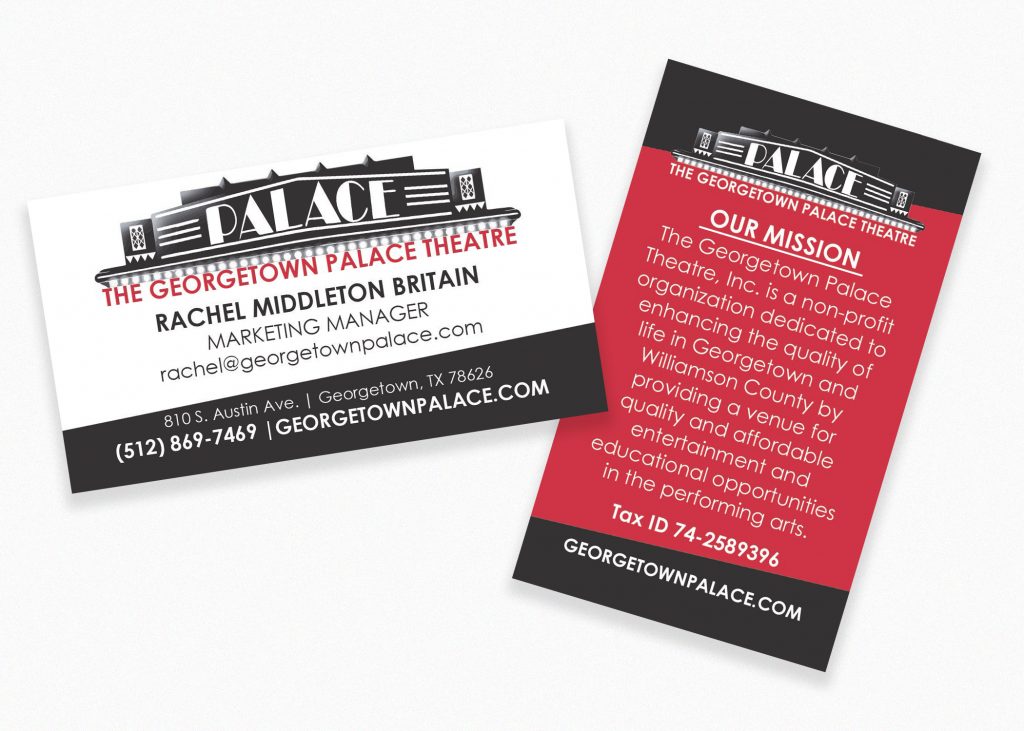
The Palace has iconic red leather front doors, so I used knew this was the perfect identifying red for the theatre. I used a Pantone swatch book to color match the doors. This red was echoed throughout the interior in the art deco carpet and the theatre seats, and an established part of the physical space, so perfect to represent the brand.
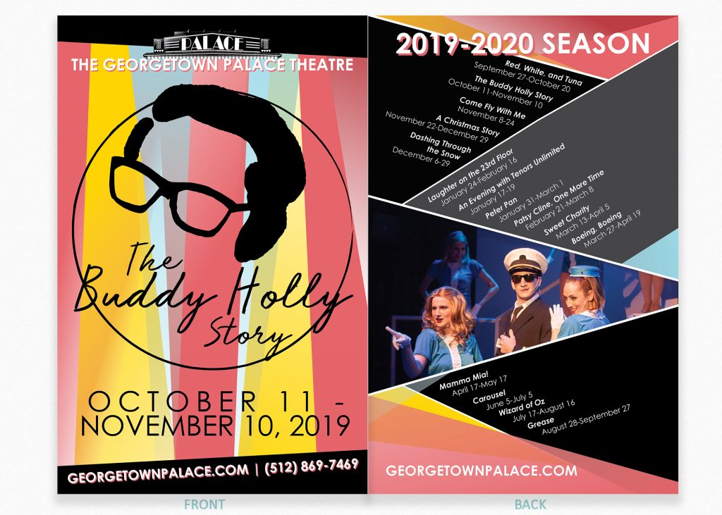
I wanted to keep the brand lines very clean, to echo the geometric sensibilities of the art deco building. For the rest of my, I wanted colors I could build entire seasons with, without it seeming like my palette was limited, so I went for variations on primary colors. My office at this time was in the theatre’s light booth, and I was inspired by theatrical lighting.
A content style guide is also available upon request.
Content Style Guide available upon request
Palace Style Guide
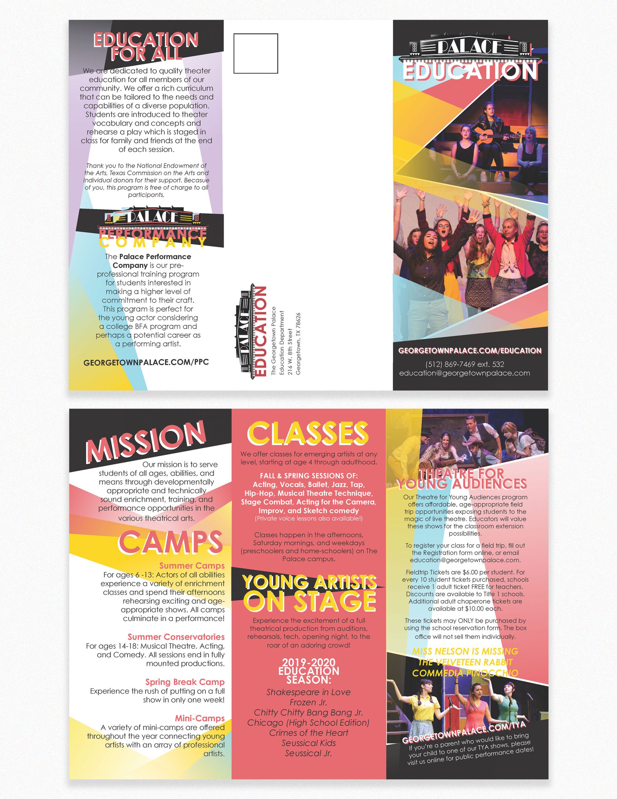
Season Guides
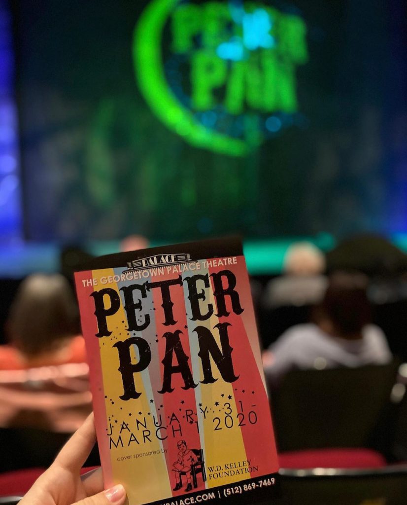
Playbills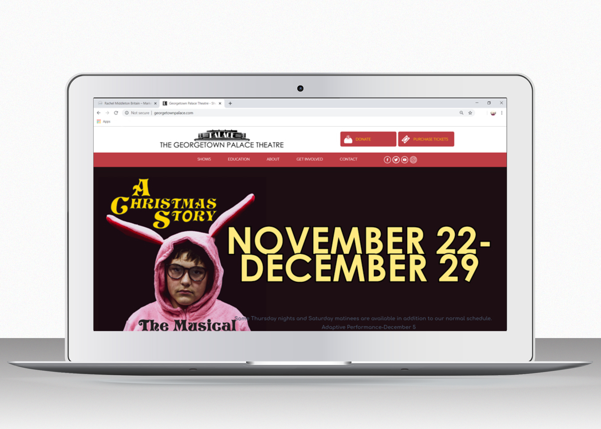
Web Site Development and Managment
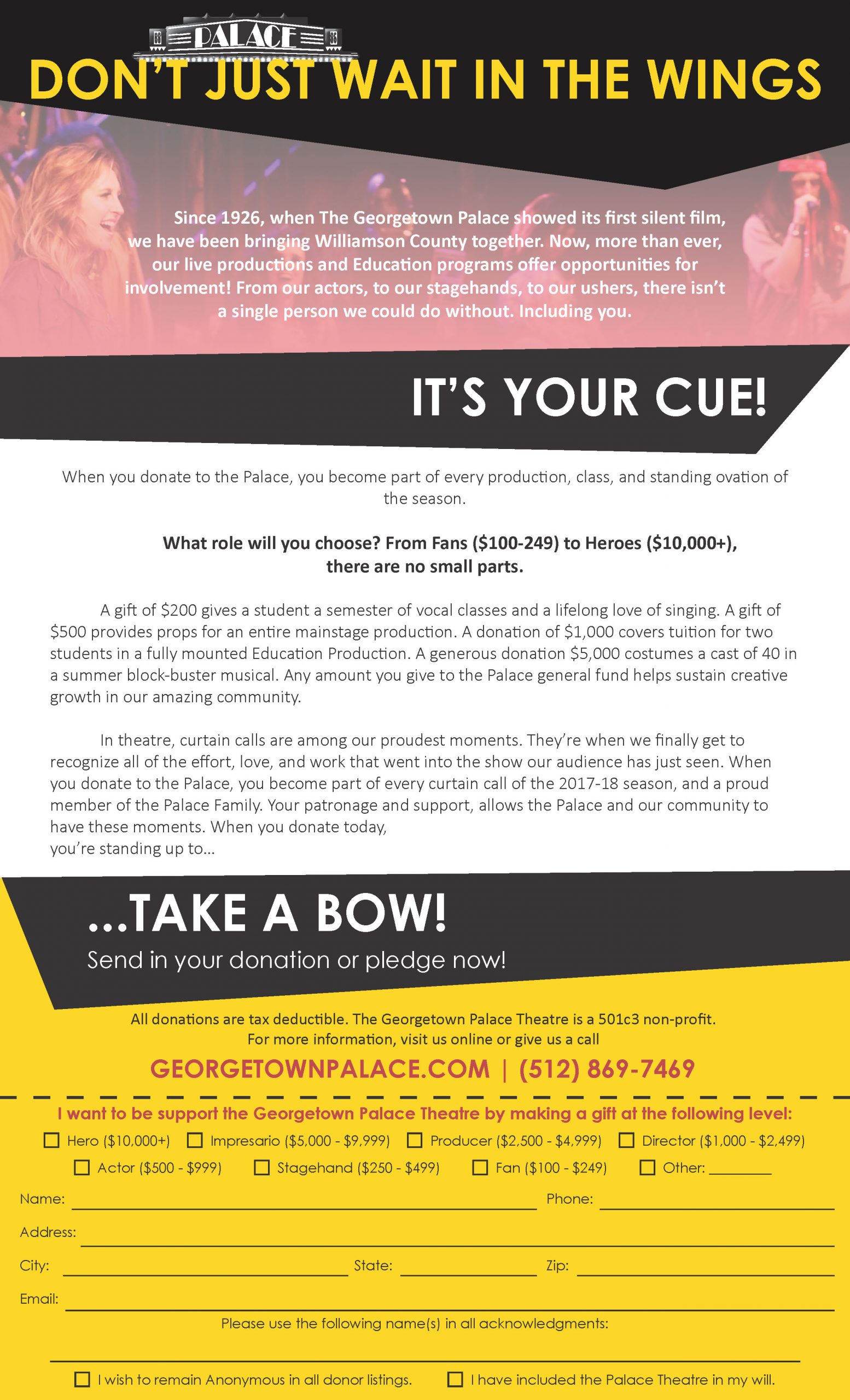
Fundraising appeal letter – Design and Message